What Indie Authors Get Wrong About Cover Design
(And How to Get It Right)
We get it. You want your book to stand out. But indie authors often sabotage their own success with cover designs that scream “homemade” rather than “hell yes, I’ll buy this.” In this post, we’re calling out the top mistakes we see in cover design for indie authors — and giving you a crash course on how to fix them without selling your soul or your style.
❌ Mistake #1: Designing for Yourself, Not Your Reader
Your cover isn’t about what you like. It’s about what your reader expects. If your romance cover looks like a horror thriller, you’ve lost your audience before they even read the blurb.
🛠 Pro Fix: Research genre bestsellers. Note the fonts, imagery, and tone. Then design to match — not copy — that visual language.
❌ Mistake #2: Using Free Images and Fonts Without Licensing
Just because it’s on Canva or Google doesn’t mean it’s safe. Using unlicensed images or fonts can lead to takedowns, lawsuits, or your book being delisted from retailers.
🛠 Pro Fix: Use royalty-free image sites with commercial licenses or hire a designer who already has access to pro assets. Pro tip: Always save your license receipts.
❌ Mistake #3: Ignoring Thumbnail View
Your gorgeous cover might look amazing full screen… but what about the postage-stamp size on Amazon? If your title or author name vanishes at that size, you’re dead in the algorithm.
🛠 Pro Fix: Always test your design at multiple sizes — especially in grayscale and on mobile. Clear contrast and bold title treatment = better click-throughs.
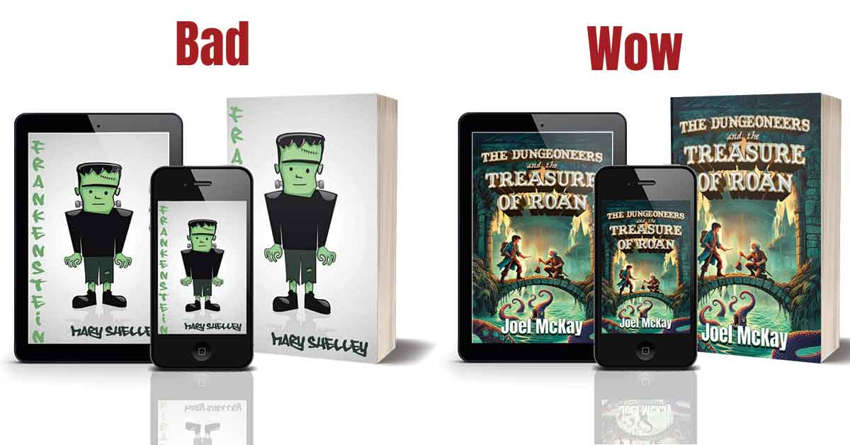
❌ Mistake #4: Sloppy Typography
Nothing screams amateur like stretched fonts, badly kerned titles, or comic sans. Typography is 80% of what makes a book cover look professional — or not.
🛠 Pro Fix: Use professionally paired fonts. Keep hierarchy clear: title > author > tagline. Never squish or stretch text to fit a space.
❌ Mistake #5: No Spine Planning
Even if you’re starting with an eBook, don’t skip planning for print. The spine needs width based on final page count, and image bleed matters more than you think.
🛠 Pro Fix: Work with a designer who knows how to build to POD printer specs — or learn to calculate spine width, margins, and bleed yourself.
Your book cover is your handshake, your first impression, and your silent pitch to a reader. It should look like it belongs on a shelf next to the pros — because that’s exactly where it’s going.






0 Comments